Brand Guidelines
This guide defines the visual language, design style, and principles that shape the Honesty brand.
At its core, Honesty is about simplicity, transparency and authenticity. This guide lays out the essential design standards that bring our brand to life, from our colour system and typography to accessibility benchmarks and documentation.
Whether you're designing for digital platforms or printed materials, these guidelines ensure every touchpoint reflects our brand.
01 Brand Strategy
Honesty Group is an independently owned hospitality and food business operating across Berkshire and Hampshire, with a family of eleven coffee shops.
Founded in 2014 by Romilla Arber, the brand emerged from a simple mission: food should be made with care, not chemicals.
Honesty positions itself as an authentic, transparent food business with strong community values. The tagline "Food; made by people who care" encapsulates the brand's ethos of genuine craftsmanship and human connection.
02 Personality
Our brand personality is warm, unpretentious, and direct. It speaks with conviction about food quality while maintaining an approachable, human tone. The personality balances passion for food with practicality, and principle with warmth.

Tone & Voice
Our Vision
To be part of a food system where transparency isn't revolutionary - it's expected.
Our Mission
We make real food and build welcoming spaces for our communities.
Our Promise: how we help
Real ingredients, transparent sourcing, and a warm welcome, guaranteed.
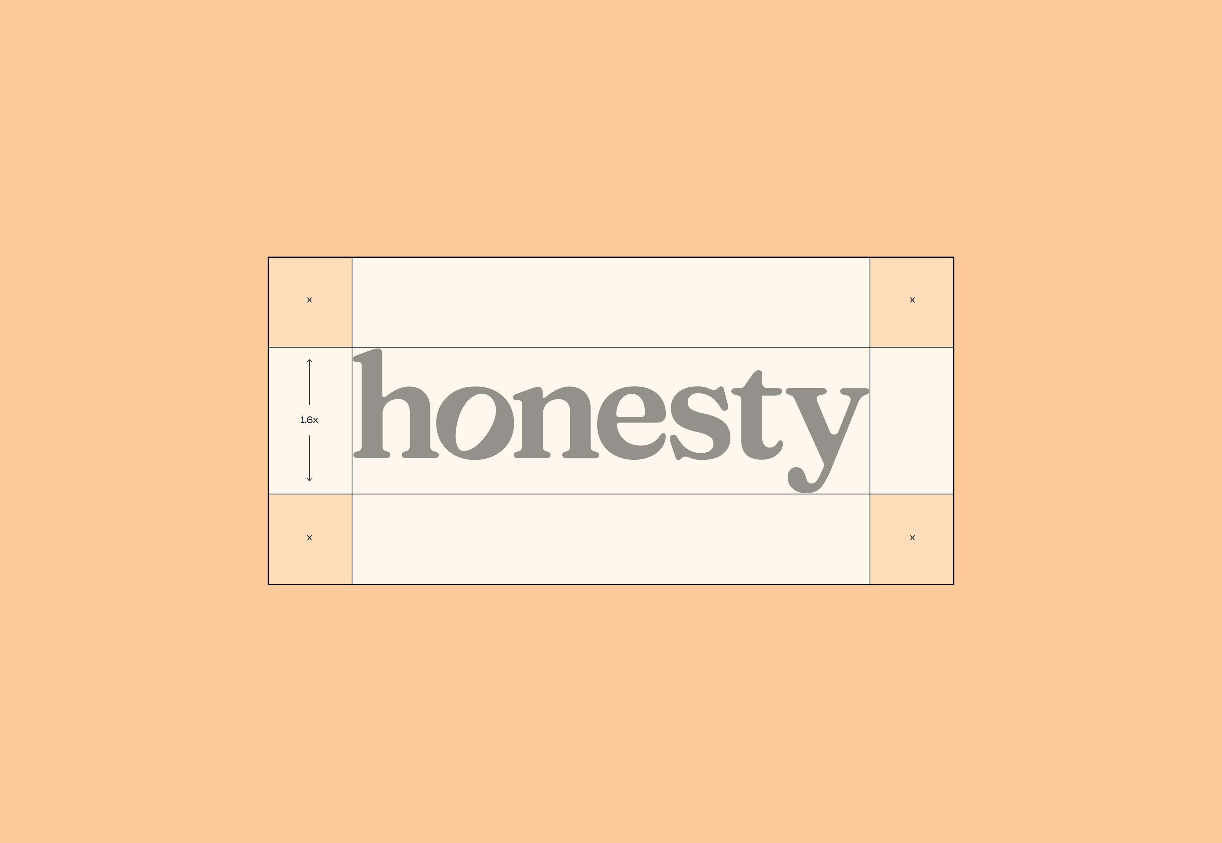
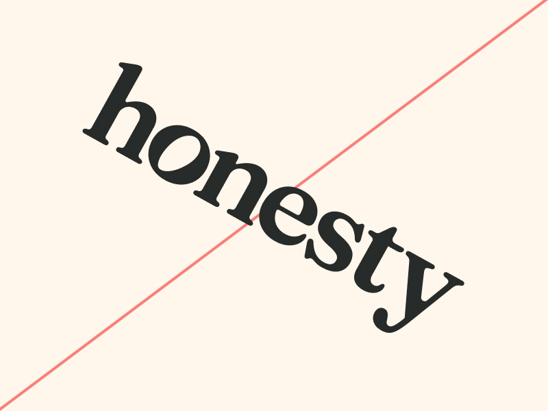
03 Logo
The Honesty logo is clean and organic, a simple word mark that accompanies and holds up our brand values, without becoming centre stage.
Built with strong, rounded corners, reduced kerning and reversed negative space within the “o”. The negative space is a call to its previous iterations, being a single petal from an honesty flower.
More than just a symbol, it is a stamp of trustworthiness and quality.
Primary Lockup

Clearspace
Incorrect Usage


Do not add noise or texture
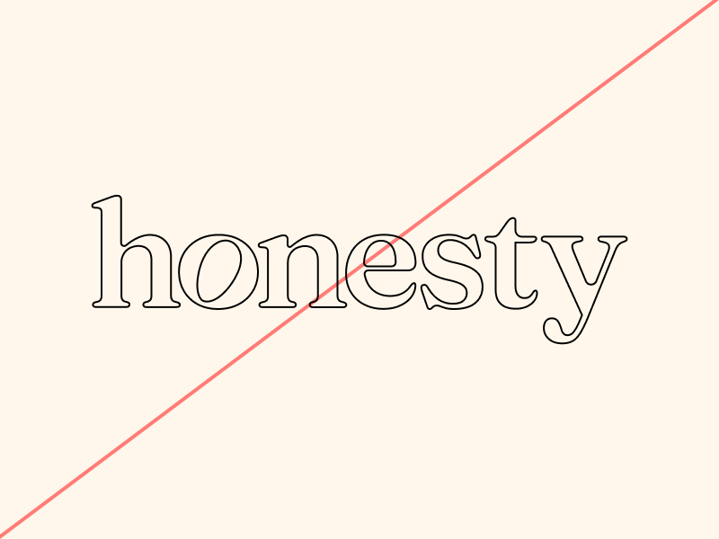
Do not outline the logo
Do not rotate the logo
Do not scale disproportionately
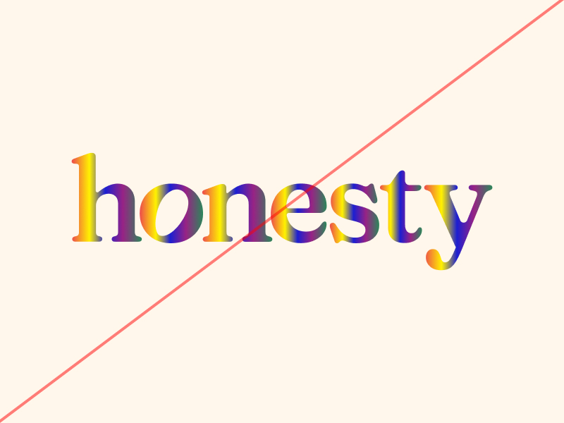
Do not add gradients to the logo
Do not recolour the logo using non-brand colours
04 Colour
Our colour palette balances warm, inviting tones with grounded neutrals, creating a contemporary yet timeless feel that's both welcoming and distinctive across all brand touchpoints. Lace is treated as our primary brand colour and colours like Haze are used for bolder executions.
Primary Palette
Lace
Hex: #FFF7EB
Midnight
Hex: #272B29
Havana
Hex: #FF9D47
Deep Teal
Hex: #2E5A57
Secondary Palette
Legacy Blue
Hex: #A0D1CB
Peach
Hex: #FFCA99
Use examples
Primary
BG Lace, FG Midnight
Bold
BG Havana, FG Lace
Inform
BG Deep Teal, FG Lace
Hint
BG Peach, FG Lace - rare use case
05 Typography
Our typography balances warmth and accessibility with a contemporary yet authentic type pairing, reinforcing our commitment to transparency, quality, and community connection.
Nohemi serves as the brand's primary sans serif typeface. Its clean, geometric forms and warm character create excellent readability across all applications. The modern aesthetic supports Honesty's progressive approach while maintaining an approachable, human quality that connects with our community-focussed values.
Fraunces is our hero serif typeface, adding character and editorial quality to key brand moments. Its distinctive soft proportions and variable weights bring personality and warmth to the identity. The typeface carries both authority and approachability, reflecting Honesty's authentic voice and commitment to transparency.
Nohemi handles everyday communications while Fraunces adds emphasis and emotional connection to brand storytelling.
For longer bodies of text, (articles, blogs) Lusitana is used to aid with readability and accessibililty.
Primary Typeface - Variable (Soft 80+only, 100 preferred)
Fraunces
Secondary Typeface
Nohemi
Tertiary Typeface
Lusitana
Sizing
The below outlines guidelines for sizing to ensure consistency and readbaility
Our Click&Collect service connects you to local suppliers, meaning that pasture raised eggs and raw honey are just one click away from collecting at your nearest Honesty.
Type Sizes 0–24pt/px
Nohemi Light
130% Leading
2% Tracking
“Pasture fed” might sound glib but at Wandering Feathers it’s about access to a naturally varied diet and a wonderful happy life outdoors. Hens are naturally curious and their environment affects everything from welfare to the nutritional quality of their eggs.
Type Sizes 0–24pt/px
Lusitana
130% Leading
0% Tracking
Victoria Sponge, made the right way with absolute no ultra-processed ingredients or chemical adulterants.
Type Sizes 24–55pt/px
Nohemi
120% Leading
-1% Tracking
Our locations never impose themselves upon communities, we enhance them.
Type Sizes 55–72pt/px
Nohemi
110% Leading
-1% Tracking
We care about food and how it is made.
Type Sizes > 72pt/px
Fraunces 72pt SuperSoft
100% Leading
-3% Tracking
06 Art Direction
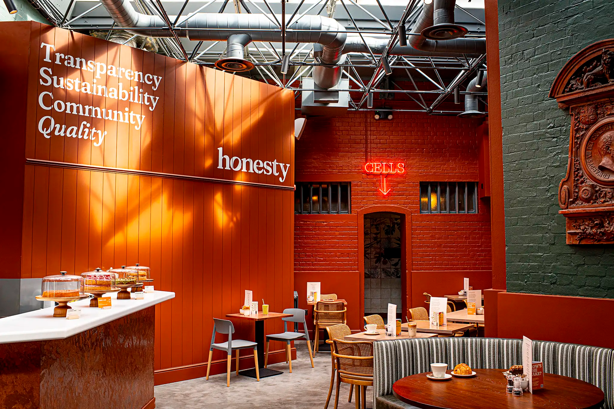
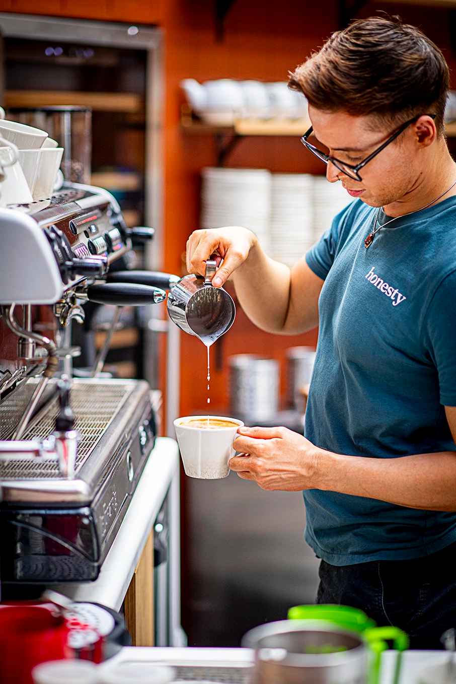
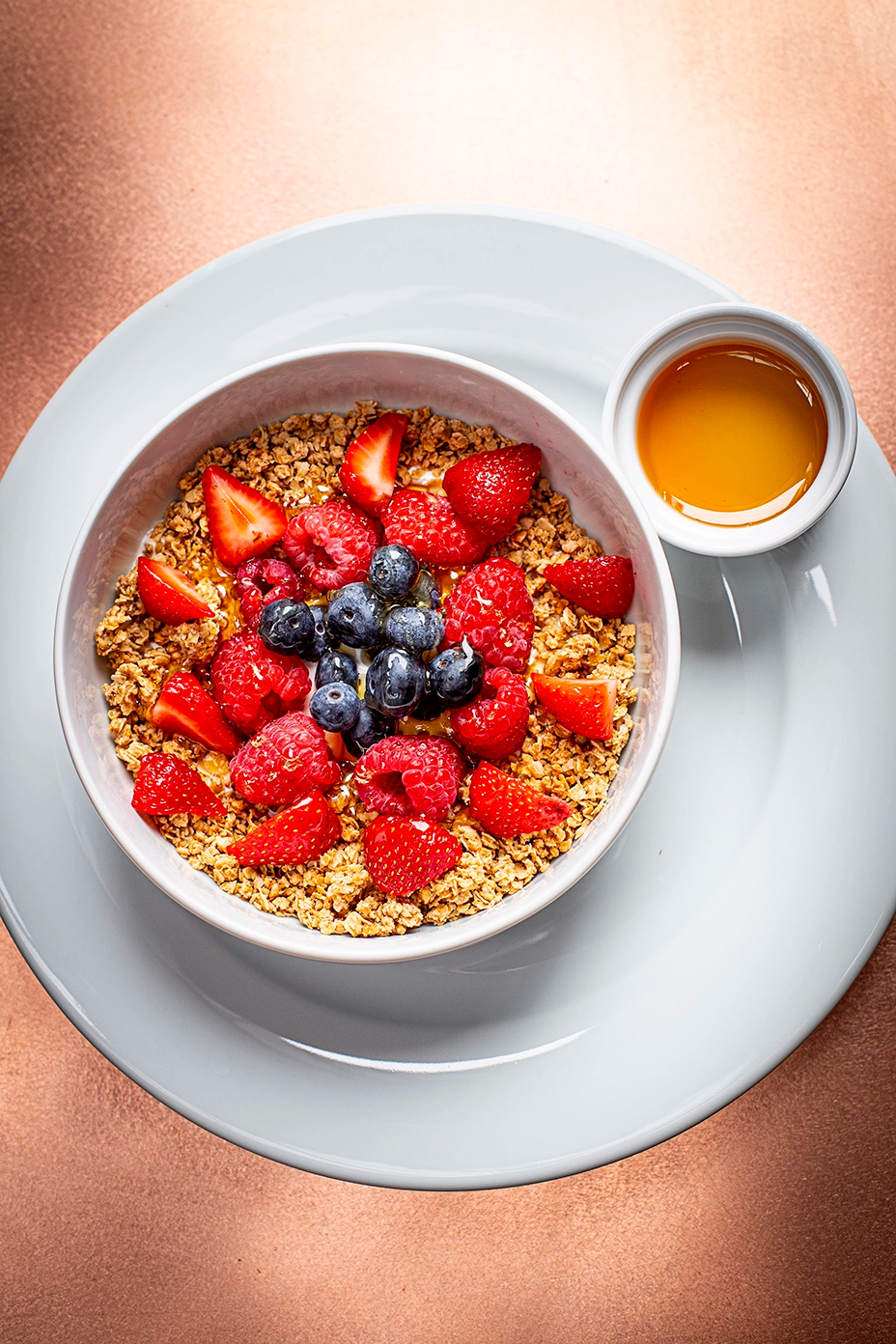
Honesty's photography style reinforces our brand's core values: quality, transparency, and community - by showcasing visuals that reflect real food, real places, and real people.
Natural & Unpolished
Photography should feature natural light and honest compositions with a relaxed, organic feel. The focus should be on authenticity, avoiding overly styled or artificial setups that feel disconnected from our spaces.
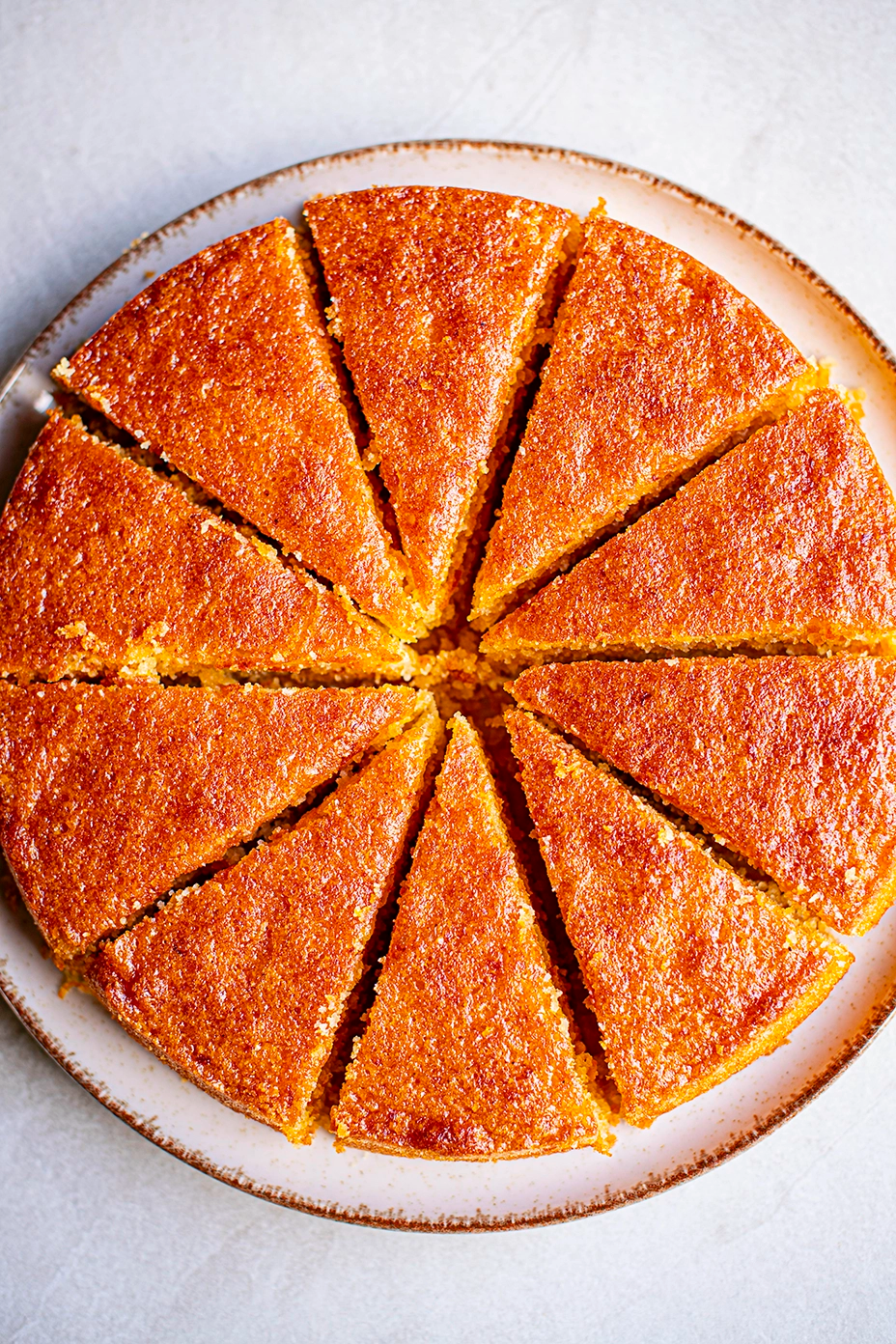
Food with Character
Images should showcase our food in its true form; rustic bread with visible texture, cross-sections revealing honest ingredients, and plating that celebrates simplicity over perfection. Close-ups should highlight the handmade quality and natural imperfections that prove our food is made by people, not machines.

Authentic Spaces
Photography should capture our locations as they truly are: welcoming, curated spaces where people gather. Include details like worn wooden tables, light through windows, whilst using wide angles when possible.
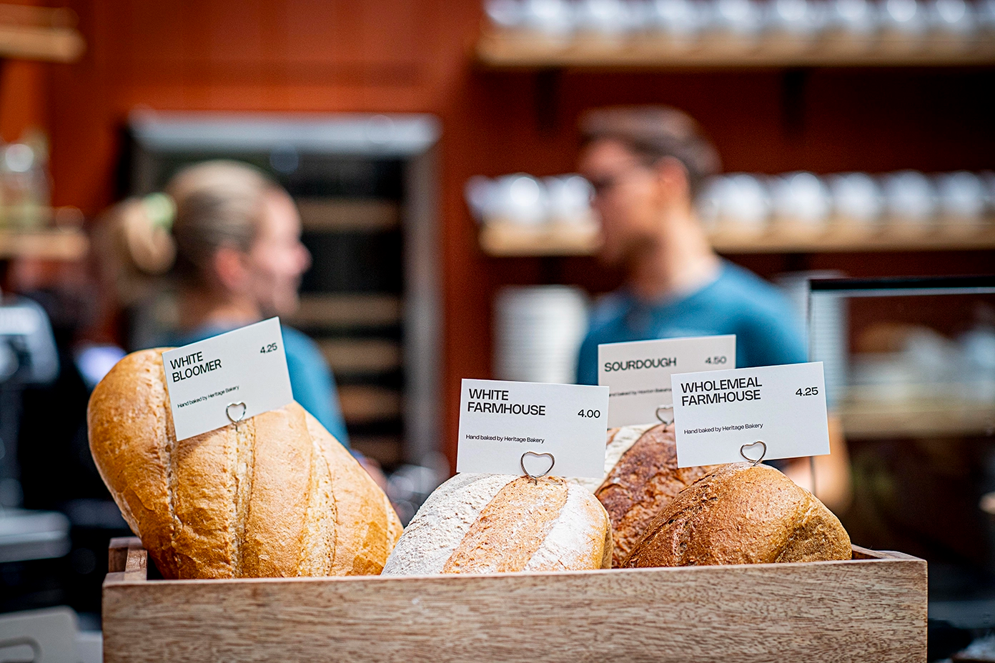
People & Connection
Images should feature real moments of connection, conversations over coffee, hands breaking bread, employees at work, or families sharing meals. Avoid posed or corporate-feeling portraits. Instead, capture genuine interactions that reflect our "bring your dog, bring your gran, bring the book club" ethos.

